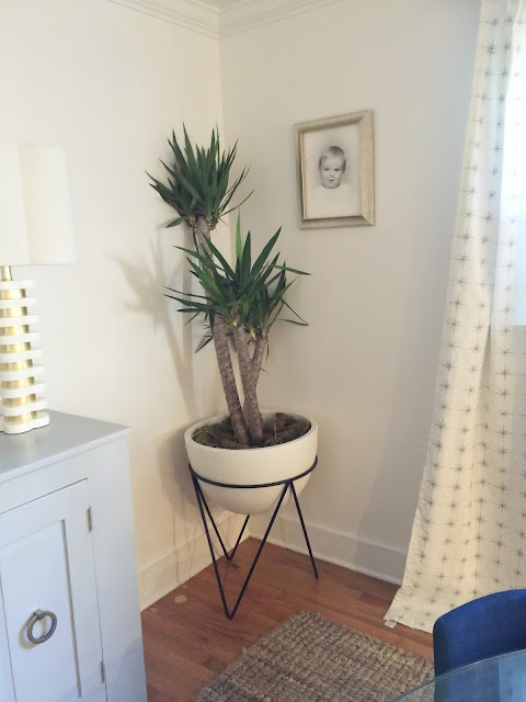
I know I have been talking about our dining room makeover for awhile now. I finally got my act together and snapped some pictures of the finished product!!
I mentioned before that I enlisted the help of Alex Kaehler to help me plan out the space. I had an idea of what I wanted but I have such a hard time making a decision sometimes and wanted someone to help me. I loved working with her so much, in fact I am going to hopefully work with her again on our den/family room next. I highly recommend her if you are looking for design help. I sent her images of rooms I liked and let her know what pieces I wanted to keep and replace. She then came up with two room plans for me. I had the option to choose either of them or neither and she would work on a new design. I actually loved them both and had a hard time deciding.
Here are the two plans. Once I chose we then made a few changes within that layout/plan.
Alex will send you a shopping list with links to all the products too which makes it super easy! That way you can shop and buy things as you want to.
and the final plan we agreed on. I combined a few things from each design. Then as I was shopping I made a few small changes as well that you will see in the photos.
When I look at the before pictures I can't believe how dark and cramped the room was.
Behold the Before in all it's glory:)
THE BEFORE
The major changes I wanted done were:
1) tear down the beadboard and put up sheetrock and re-paint
2) rip out the bar and sink in the corner. It really served no purpose since our dining room is connected to our kitchen and we have a sink and storage in there. It bothered me because I could never center a piece of furniture on that wall.
3) Rip out the small half wall between the kitchen and dining room
4) The hutch was a piece passed on to us from my in-laws so I wanted to keep it but it needed to be updated.
THE AFTER
I honestly can't tell you how much I love this room. It is where we spend so much time and it is so bright and happy now. Since we live in a smaller house it serves so many purposes for us from family dinners, to where the kids do homework and art, and also where we entertain friends.
I found the mirror at Homegoods and knew it would be perfect in the space. I decided instead of artwork flanking the windows to use photographs of Sterling and Frances by DuBose Photography.
Funny story I have had the glass dining room table since college. The people who lived in the house before us didn't want to move it and sold it to me for $50 and I still love it to this day. It is a pain to move because the glass is so heavy but I just love the modern look of it.
Details and sources are at the bottom of the post
D E T A I L S + S O U R C E S
Design Plan | Alex Kaehler Design
Wall Color - Decorators White
Hutch color - Coventry Gray
Table - old
Mirror - Homegoods
Lamps- GDC Home
Bar Table- Consignment Find in Charlotte
Decanters- old, various places
Light Fixture- Lowes


19 comments:
That room looks amazing! We just redid our dining room and I almost bought that ocean painting... Question for you. Are the stars on the curtains gold or silver? I'm having a hell of a time trying to find white and gold curtains for our office. Thanks!!
Nice! Everything came together quite well. It is amazing how much brighter your space looks with a few simple changes.
Gorgeous!!! So bright and airy now!
Natalie, this looks so good! Seems like a totally different room now. Love!
What a huge difference - looks SO nice!! :)
It looks great! How do you like that rug? Does it shed a lot? We have a jute rug but with tassels/ties on the ends and those things shed, so looking for one that doesn't shed as much because I love the look and feel :)
Looks great!! Loving those chairs and that fun planter! So much lighter and airier in there now!
Oh wow, the after photos are incredible! I can't believe how lightened up everything is!
https://forsevenseasons.wordpress.com
I'm so happy you're happy with it. It looks beautiful!!! We loved working with you!
It looks gorgeous! I love the new lighter and brighter look!
Wow! It looks so different! Really stylish and much brighter. :-)
It looks amazing!!! Love every detail! xx
Wow! It truly looks fantastic! What a difference!
The changes look great, really made a difference!
Wow! What a wonderful change! Nice job and so much brighter.
Love it!!! Looks amazing!!
Looks so stylish and bright!
Oh wow! Beautifully executed. Looks great. Like your choice to put the kids' pics flanking the window.
I'm dealing with the same thing with my rug. Looking for one that doesn't shed!!!
Post a Comment